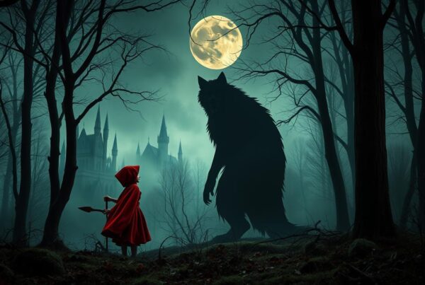
If you are a fan of horror novels, you have likely come across the Stephen King font. Designed to instill fear and uncertainty, this font has become synonymous with the eerie atmosphere characteristic of Stephen King’s work. Its distinctive features have made it a favorite among graphic designers and horror novel enthusiasts alike.
In this article, we will explore the origins, unique characteristics, and application of the Stephen King font in graphic design and horror novels. We will also provide tips and guidelines for selecting the appropriate variation of the font for your projects.
Key Takeaways:
- The Stephen King font is a popular choice for both horror novel enthusiasts and graphic designers.
- Its bold, jagged lines and intricate details contribute to its distinctive horror novel feel.
- The font can be effectively incorporated into horror novel designs to reinforce the atmosphere of suspense.
- Choosing the appropriate variation of the font is crucial for creating the desired impact in your projects.
- Utilize the Stephen King font alongside effective design principles to create visually appealing and impactful results.
Exploring the Origins and Inspiration Behind the Stephen King Font
The Stephen King font has grown to become popular among horror novel enthusiasts and designers alike. But where did the idea for this frightening font come from?
Stephen King, as a writer, has always had an incredible knack for creating eerie environments, complex characters, and terrifying monsters. Inevitably, designers of book covers and movie posters that needed to communicate the spine-tingling feel of his novels had to turn to fonts that could convey the sense of fear.
The goal was to create a font that would be an essential part of horror designs and capture the essence of Stephen King’s writing.
The Stephen King font originated due to the need for aunique and fitting font for Stephen King’s work. Harold Lohner, a typographer and type designer, was the mind behind the font. He has described the Stephen King font as a dark and spooky font, based on lettering from the 19th century.
| Font Characteristics | Origin |
|---|---|
| Unique and Distinctive features | Custom-made due to the need for a suitable font for Stephen King’s novels |
| Bold, jagged, and intricate lines | Harold Lohner based the font on lettering from the 19th century |
The Concept behind the Stephen King Font
Harold designed the Stephen King font to evoke an eerie and suspenseful atmosphere that encapsulated Stephen King’s writing style.
He stated that the font’s features, such as its rough edges and jagged lines, were inspired by classic horror movies and Stephen King’s gothic and supernatural stories. The goal was to create a font that would be an essential part of horror designs and capture the essence of Stephen King’s writing.
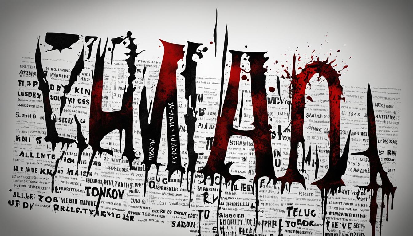
The Distinctive Features of the Stephen King Font
The Stephen King font is designed specifically to capture the eerie and suspenseful atmosphere prevalent in horror novels. In this section, we explore its unique characteristics that contribute to its distinctive appeal.
Bold and Jagged Lines
The Stephen King font is characterized by bold and jagged lines that give it a rough and edgy appearance. The font’s jagged edges convey a sense of unease and fear, which makes it an excellent choice for horror novel designs.
Intricate Details
The font’s intricate details enhance its horror novel feel, making it suitable for a range of projects. The font variation features details like sharp corners, pointed serifs, and intricate flourishes which contribute to the font’s overall design and differentiate it from other horror fonts.
“The Stephen King font is the perfect example of typography that catches the eye and makes the reader feel the emotion of a horror novel. The bold lines and intricate details are unique and immediately recognizable.”
Usage
| Use Case | Impact |
|---|---|
| Book Covers | The Stephen King font adds a sense of unease and suspense to the book cover, immediately grabbing the attention of horror novel enthusiasts. |
| Movie Posters | The bold, jagged lines and intricate details of the font deliver an eerie atmosphere, resonating with the horror movie genre, and enticing audiences to watch the movies. |
| Graphic Designs | The Stephen King font adds a distinctive feel to graphic designs that match the horror genre, making it perfect for posters, flyers, and social media visuals to create scary and engaging content. |
Whether used alone or in combination with other horror-themed fonts, the Stephen King font is an excellent way to create a sense of fear, anxiety, and unease in any design.
Integrating the Stephen King Font in Horror Novel Designs
Horror novel designs rely on visual elements to create an atmosphere of suspense and fear. The Stephen King font is an effective tool in achieving this objective. The bold, jagged lines and intricate details of the font contribute to its horror novel feel, making it a popular choice among designers and horror novel enthusiasts.
When incorporating the Stephen King font in horror novel designs, it is essential to consider the overall aesthetic and ensure that the font reinforces the desired atmosphere of suspense. For example, the font can be used in book covers to highlight the title and evoke a sense of intrigue. It can also be used in movie posters to emphasize the film’s genre and enhance the overall visual effect. Additionally, the font can be utilized in social media graphics to promote horror novels and engage with potential audiences.
Using the Stephen King font in horror novel designs requires careful attention to detail and an understanding of the visual language of the horror genre. When used effectively, the font can reinforce the atmosphere of suspense and elevate the overall aesthetic of the design.
Choosing the Right Stephen King Font Variation for Your Project
When selecting the perfect Stephen King font for your project, it’s crucial to consider your design goals and the impact you want to achieve. The Stephen King font family offers several variations, each with distinctive features that can enhance the overall aesthetic of your design. Here are some variations to consider:
| Font Variation | Distinctive Features |
|---|---|
| Carnivalee Freakshow | The bold, twisted strokes evoke a creepy circus or carnival vibe. Great for designing posters and book covers. |
| Kingthings Trypewriter | This font mimics the look of an old-fashioned typewriter, adding a vintage feel to designs. Ideal for titles and short messages. |
| Dark Half | A serif font variation that’s perfect for conveying an elegance in horror themes. Ideal for book titles, subtitles, and body texts. |
Ultimately, the Stephen King font variation you choose must align with your design objectives, project scope, and reader expectations. Take the time to carefully assess each font variation’s unique features and select the one that will give your design the biggest impact.

Tips for Using the Stephen King Font in Graphic Design
Graphic design is an art that involves much more than simply creating an attractive layout. One of the most crucial design elements for horror-themed projects is selecting the perfect font. The Stephen King font is an effective choice for creating a spine-tingling effect. Here are some tips on effectively integrating the Stephen King font into your graphic design:
Font Pairing
Tip: When pairing the Stephen King font, choose a complementary font that balances its bold, dramatic style. A clean, simple font can help to offset the sharp lines and intricate details of the Stephen King font and ensure a cohesive design.
Hierarchy
Tip: Incorporate the Stephen King font in headlines or titles to create a chilling impact. It is recommended to pair it with a simpler font in body copy to emphasize the hierarchy and visual flow of the design.
Readability
Tip: Despite being bold and dramatic, the Stephen King font can be hard to read at smaller sizes. Ensure that the font is legible and readable in your design, and if in doubt, opt for a larger font size.
“The Stephen King font can add a creepy and suspenseful atmosphere to your horror designs. With a little creativity and consideration, you can use it effectively in your graphic designs.”
Showcasing Real-Life Examples of the Stephen King Font in Action
Visual media is an ideal platform to display the Stephen King font’s ability to capture and create an eerie atmosphere. Below are some real-life examples where the font has been applied to evoke a sense of fear and suspense.
Example 1: Book Cover – The Shining
The Stephen King font’s characteristic jagged lines are prominently featured on the cover of “The Shining,” one of King’s most popular novels. The bold, all-caps font is used to create a sense of impending danger and elevate the chilling imagery of the cover art.
Example 2: Movie Poster – IT
The font was a key element in the design of the movie poster for “IT,” a 2017 horror film adaptation of King’s novel of the same name. The poster features the font prominently in bold letters, neatly paired with an unsettling image of the iconic villain, Pennywise the Clown.
Example 3: Video Game Logo – Silent Hill
The Stephen King font was also the inspiration for the logo and promotional material of the popular horror video game franchise, Silent Hill. The font’s distinctive lettering echoes the unsettling, suspenseful atmosphere of the game and has become an iconic symbol among horror gaming fans.
Example 4: TV Series Opening Credits – Stranger Things
The Stephen King font is featured in the opening credits of the hit Netflix series, “Stranger Things.” The font’s bold, retro aesthetic encapsulates the show’s eerie, supernatural themes and its ’80s nostalgia.
These are just a few examples of how the Stephen King font has been strategically used to enhance the horror genre in various forms of visual media, showcasing its versatility and impact in creating a bone-chilling atmosphere.
Stephen King Font: A Must-Have for Horror Novel Enthusiasts
As a horror novel enthusiast, you understand the importance of creating an immersive and suspenseful reading experience. The Stephen King font is an essential tool in achieving this goal. Its bold, jagged lines and intricate details capture the eerie and haunting atmosphere prevalent in horror novels, allowing you to create an instant connection with your audience.
By incorporating the Stephen King font in your personal creations, you can elevate your designs to new heights, immersing readers in a world of fear and suspense. Whether you’re designing a book cover, movie poster, or website, the Stephen King font can help you create a unique and captivating aesthetic that sets you apart from the competition.
Creating a Deeper Connection with the Horror Genre
The Stephen King font is more than just a stylistic choice. It has the power to create a deeper connection with the horror genre, drawing readers into the terrifying worlds that you create. By using a font that evokes the essence of horror, you can heighten the emotional impact of your writing, leaving a lasting impression on your readers.
Don’t just take our word for it – check out the real-life examples below to see how the Stephen King font has been effectively employed in horror novel designs:
| Book Cover | Movie Poster |
|---|---|
As you can see, the Stephen King font is a powerful tool in creating a sense of fear and suspense in visual media. By incorporating it in your designs, you can take your horror novel creations to the next level.
Conclusion
In conclusion, the Stephen King font has proven to be an ideal choice for capturing the essence of horror novels. Its unique design elements, inspired origins, and distinctive features make it a popular choice among horror novel enthusiasts and designers alike. With its ability to evoke a sense of fear and suspense, it is a must-have for graphic design projects, book covers, and movie posters within the horror genre.
By selecting the appropriate variation of the Stephen King font and utilizing it effectively, designers can create compelling visuals that not only align with the horror novel feel but also enhance the overall reading experience. Overall, the Stephen King font is a powerful tool that can help designers connect with horror novel enthusiasts and reinforce the impact of the horror genre in popular culture.
FAQ
What is the Stephen King font?
The Stephen King font is a typeface inspired by the renowned author Stephen King’s works. It captures the essence and atmosphere of horror novels, making it a popular choice among horror enthusiasts and designers.
What is the inspiration behind the creation of the Stephen King font?
The Stephen King font draws its inspiration from the eerie and suspenseful ambiance prevalent in Stephen King’s novels. It aims to reflect the unique tone and feeling associated with his works, contributing to an immersive reading experience.
What are the distinctive features of the Stephen King font?
The Stephen King font stands out with its bold and jagged lines, intricate details, and a gothic aesthetic. These characteristics evoke a sense of danger and suspense, aligning perfectly with the horror genre it represents.
How can the Stephen King font be integrated into horror novel designs?
The Stephen King font can be effectively incorporated into horror novel designs by utilizing it for titles, chapter headings, or other prominent text elements. Its unique style enhances the overall aesthetic and reinforces the atmospheric theme of suspense.
What are the different variations of the Stephen King font?
The Stephen King font family offers various variations to choose from, each with its own distinct characteristics. These variations allow designers to select the most suitable font style based on their specific project requirements and desired impact.
What are some tips for using the Stephen King font in graphic design?
When utilizing the Stephen King font in graphic design, it is important to consider font pairing, hierarchy, and readability. Combining the font with complementary typefaces, establishing clear visual hierarchy, and ensuring legibility contribute to effective design outcomes.
Can you provide real-life examples of the Stephen King font in action?
Certainly! The Stephen King font has been successfully employed in various book covers, movie posters, and other visual media to evoke fear and suspense. These examples demonstrate the font’s ability to create a chilling ambiance and captivate audiences.
Why should horror novel enthusiasts use the Stephen King font?
The Stephen King font offers horror novel enthusiasts an opportunity to enhance their personal creations by authentically capturing the horror genre’s essence. By incorporating this font, readers are more likely to have a heightened and immersive reading experience.